
This text has been translated by a machine and has not been reviewed by a human yet. Apologies for any errors or approximations – do not hesitate to send us a message if you spot some!
The press regularly reports on the evolution of inequalities in France: according to Les Echos, they have decreased in 2019, while a government website states that they have “increased slightly since 2008”. It is therefore legitimate to try and understand what these assertions mean in concrete terms, in either case. In this respect, the notion of “inequality” also deserves clarification. We will concentrate here on the measurement of monetary inequalities. 1 In this context, we need to distinguish between questions of wealth and income. The eruption into public debate of the question of the enrichment of the very wealthy has revived debates on wealth inequalities, and thus invites us to study them. With regard to the measurement of income inequality, we will show that there are a multitude of possible approaches. We will see that in France, despite a reduction in monetary inequalities since 2011, income inequalities are more marked today than they were in the 1980s.
Financial inequalities concern wealth and income
When it comes to monetary inequality, the most common approach is to study wealth and income inequalities. These two concepts need to be clearly defined.
Defining and measuring wealth inequality
According to INSEE, household wealth includes financial assets (financial assets, savings, etc.), real estate and professional assets (particularly important for farmers and self-employed professionals, who accumulate assets essential to their professional activity).
A distinction is then made between gross and net assets. Net assets correspond to gross assets minus the amount of capital owed on loans.
To assess this, Insee currently conducts panel surveys (i.e., periodically questioning the same group of households about their wealth). To go further back in time, it is possible to estimate household wealth on the basis of inheritance taxes (i.e. estate declarations). Inheritance tax was introduced before income tax. 3
However, while the notion of wealth may seem ideal for measuring a household’s “wealth”, it does not take into account the future gains of certain present investments – this is notably the case for investments in education, which generally translate into higher future wages and therefore greater future wealth. 4
To study wealth inequalities, we use two statistical concepts: distribution and deciles (see box below).
Understanding the concepts of distribution and decile
When we look at wealth inequality, we study wealth distribution, i.e. how wealth is distributed in France.
Statisticians then seek to rank the population (or households) in ascending order of wealth, from lowest to highest. To do this, they usually divide the population into 10 groups of equal size: this means dividing the population, according to wealth, by 10%.
In concrete terms, the 10% of the population with the lowest wealth are in the first group, the next 10% in the second group… and finally the 10% with the highest wealth are in the tenth group.
The value separating the 1st group from the second is called the first decile (D1): in other words, the first decile is the amount of wealth below which the lowest 10% of wealth is found, and above which 90% of wealth is found. The value separating the second from the third group is the second decile (D2), etc., and the value separating the 9th from the 10th group is the ninth decile (D9). The ninth decile is the value of the wealth below which 90% of people’s wealth lies, and above which the top 10% of people’s wealth lies.
The notions of distribution and decile are also used to study other types of inequality, such as income inequality.
The distribution of wealth in France and the wealth levels of the richest and poorest can be illustrated by the first graph below.
Gross and net wealth deciles in France in 2018 (in euros)
Reading: in France, in 2021, 10% of households will have gross assets of over €607,700 and 40% of households will have gross assets of less than €100,000.
MISSING DATAVIZ: deciles-de-patrimoine-brut-et-net-en-france-en-2018-en-eurosSource Insee, Household income and wealth, 2021 edition.
Changes in the wealth of the rich
Recent debates about the great fortunes of the world’s billionaires have prompted us to take a closer look at the evolution of their wealth. A recentOxfam study reveals that, during the COVID-19 crisis, the 10 richest men in the world saw their wealth double – they now own more than the 3.1 billion poorest people – while 99% of humanity had lower-than-expected incomes during the same period.
To take this a step further, let’s look at the wealth of some of the world’s wealthiest individuals over a longer period, starting with the billionaires. 5 The number of billionaires has risen from 140 in 1987 to over 1400 in 2013. Unsurprisingly, the sum of their wealth has also increased, multiplying by almost twenty over the same period. 6 However, given that there are more people in this group, it’s not surprising that the sum of their fortunes is greater. It is therefore not easy to measure their enrichment from this data.
If we relate the number of billionaires to the world population and if we relate their wealth to that of private wealth 7 in 1987 there were 5 billionaires for every 100 million people, and in 2013 there were 30. At the same time, the circle of billionaires held 0.4% of the world’s private wealth in 1987, compared with 1.5% in 2013. 8 Nor is this enough to deduce a clear trend in wealth inequality: as this group represents a larger share of the world’s population today than at the end of the 1980s, it’s hardly surprising that the share of global wealth held each year by all billionaires has increased.
One way to better understand the dynamics of the wealth of the rich is to study the evolution of the wealth of a fixed percentage of the world’s population. For example, we can study the case of the 0.00000005% highest wealth in the world (i.e. the 143 highest wealth in 1987, and the 234 highest wealth in 2013). As illustrated in the figure below, we can see that this small group, while still representing the same share of the world’s population, saw its share of wealth triple between 1987 and 2013, from 0.31% to 0.91% of the world’s private wealth.
This trend reflects a substantial increase in wealth inequality on a global scale, between the few wealthiest individuals and the rest of the world.
Share of the world’s top 0.00000005% in global private wealth (1987-2013)
Reading: in 1987, the 0.00000005% of the world’s wealthiest people held 0.31% of the world’s private wealth.
MISSING DATAVIZ: part-en-des-000000005-plus-hauts-patrimoines-au-monde-dans-le-patrimoine-prive-mondial-1987-2013Source Thomas Piketty, Le capital au XXIe siècle, Seuil, 2013, p 694.
Defining and measuring income inequality
Income is another possible approach to measuring monetary inequality.
Income shouldn’t be confused with salary
“Salary”, also known as wage income, corresponds to the sum of wages received by an individual in a given year, net of all social security contributions. Wage income captures, to a certain extent, an individual’s “wealth”, but does not take into account social benefits, taxes or capital income. This data is important for studies of monetary inequality, since taxes and social benefits are wealth redistribution mechanisms put in place by the state to correct certain inequalities.
Definition of disposable income
So, to study income inequality, it seems more appropriate to take these redistribution mechanisms into account. For this reason, we prefer the notion of disposable income to that of wage income when studying income inequalities.
“Disposable income is the income available to a household for consumption and savings. It includes income from employment net of social security contributions, unemployment benefits, retirement and pensions, income from assets (property and financial) and other social benefits received, net of direct taxes.” (source: Insee)
One of Insee’s latest studies on income and wealth issues in France offers a representation of household disposable income in France in 2018 (see below).
Breakdown of household disposable income in 2018
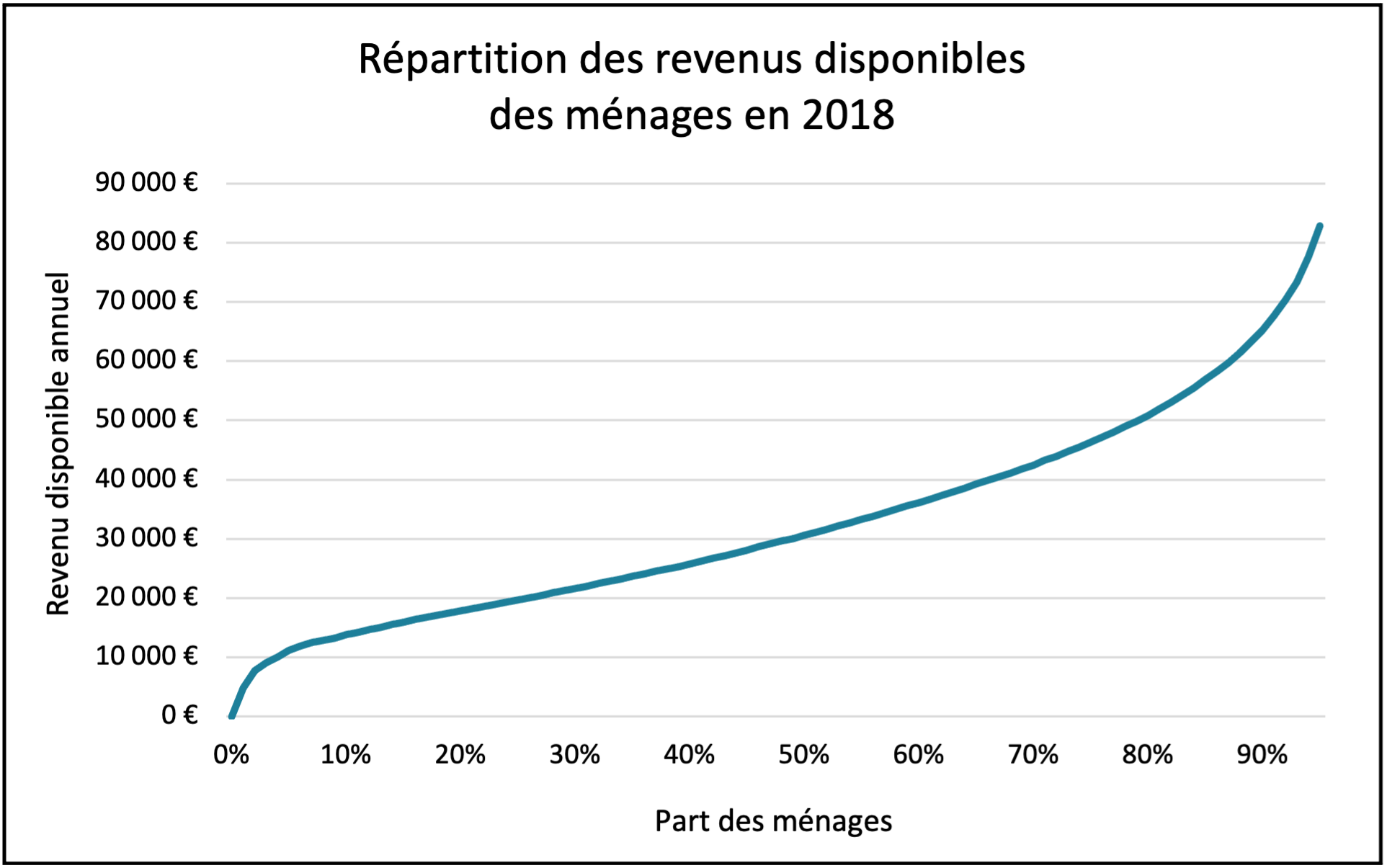
Source Insee, Household income and wealth, 2021 edition.
Reading: in 2018, 50% of households had an annual disposable income of less than €30,620.
A major limitation of using income to measure inequality remains the failure to take into account pre-committed expenditure (or forced expenditure). These are characterized by the fact that they are compulsory by law or contract. They include rent, loan repayments and certain bills (energy, water, telecommunications subscriptions, etc.). These pre-committed expenses may conceal other inequalities – notably because their share of a household’s budget decreases as the standard of living rises.
Household size: an important factor in calculating income inequality
To assess a household’s standard of living, the notion of consumption unit is preferable to that of household.
The above-mentioned Inseestudy looks at the distribution of income and wealth in France, comparing households with one another. Consider two households with the same wealth and income. If the first household is a childless couple, and the second is a couple with 2 children, then, intuitively, the childless couple is better off (lives “better”) than the couple with children. This intuition reflects the fact that household size is an important factor when it comes to income inequality. However, a household’s disposable income is independent of the number of individuals in it.
To address this issue, disposable income is sometimes replaced by standard of living. A household’s standard of living, expressed in euros, corresponds to its disposable income, divided by a number that depends on the size and profile of the household (the more individuals in the household, the greater the number). This number is called the number of consumption units (CU) in the household.
Different methods are used to calculate the number of consumption units in a household
A method commonly used, by Insee in particular, is to attribute 1 CU to the first adult in the household, 0.5 CU to other people aged 14 or over and 0.3 CU to children under 14. 9 This method, known as the ” modified OECD equivalence scale “, is not the only way of determining the number of CUs in a household.
In this respect, the OECD has recently preferred another method, known as the ” N-root equivalence scale “. In concrete terms, the number of CUs in a household depends solely on the number of individuals in the household, regardless of age. 10 As we discussed in another fact sheet on calculating GDP, the choice of convention is a human one, and each convention has its own biases, advantages and disadvantages.
Beyond technical considerations, let’s remember that the standard of living, expressed in euros, makes it possible to compare the incomes of households of different sizes, and that several conventions exist for calculating a household’s standard of living.
Find out more
- Insee’s interactive tool on salaries
- Insee, Household income and wealth, 2021 edition
- Michèle Lelièvre, Nathan Rémila, “Des inégalités de niveau de vie plus marquées une fois les dépenses pré-engagées prises en compte”, DREES, Etudes et résultats n°1055, 2018.
- Louis Maurin, “Dépenses contraintes et logement. Un poids trop lourd à porter?”, Constructif, vol. 59, n°2, 2021, p.42-46.
The Gini coefficient, a synthetic indicator of income inequality
The Gini coefficient is a commonly used indicator of inequality. It is a so-called “synthetic” indicator, meaning that it summarizes income distribution in a single figure, by weighting and aggregating all incomes (find out more about synthetic indicators in our module on GDP, growth and planetary limits).
What is the Gini coefficient?
The Gini coefficient (or index) is an income distribution indicator developed in the early 20th century. Its value ranges from 0, corresponding to “perfect equality” (each household receives the same fraction of income), to 1, representing “perfect inequality” (the richest fraction of the population receives all income). The relevance of the Gini coefficient lies in the fact that it takes into account the entire income distribution in the population (“synthetic” indicator).
To obtain it, we need to go through the so-called Lorenz curve (in reference to the economist Max O. Lorenz). It represents, on the ordinate, the share of income held by the proportion, on the abscissa, of the population (ranked by increasing income, i.e. from the poorest to the richest), as illustrated in the figure below.
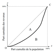
The Lorenz curve always joins the origin (point O) to the point with coordinates (100%, 100%) (point C), reflecting the fact that if we consider the whole population, we include all household incomes. If the Lorenz curve is a straight line (the line linking O and C on the figure), then all households have the same income. Conversely, in the extreme case of one person monopolizing all the income in a country, the curve would be in two pieces: a horizontal one up to 100%, then a vertical one up to point C.
The Gini coefficient is equal to the ratio between area A and the area of the triangle A+B (equal to ½). It ranges from 0 to 1, and is higher the more unequal the distribution.
Some examples of how the Gini coefficient is used
The Gini coefficient is used to compare inequalities between countries. Below, we show the Gini coefficients for living standards in European Union countries in 2019. They are listed in ascending order. Slovakia is the most egalitarian country, with a Gini coefficient of 0.209, while Bulgaria is the most unequal, according to this measure, with a Gini coefficient of 0.400.
Gini coefficient for European Union countries in 2019
Reading: in 2019, Slovakia’s Gini coefficient is 0.209.
MISSING DATAVIZ: coefficient-de-gini-pour-les-pays-de-lunion-europeenne-en-2019Source Insee, Standard of living and inequality indicators in the European Union (annual data 2019), December 17, 2021. Note: standard of living corresponds to household disposable income divided by the number of consumption units (calculated using the modified OECD scale method).
It is also interesting to visualize the evolution of the Gini coefficient for a given country. Let’s take the case of France, where the evolution of the Gini coefficient between 1970 and 2018 is shown below. This representation is all the more relevant as public debate is sometimes limited to a short-term vision of the evolution of inequalities, whereas a long-term vision offers a more global perspective. In France, for example, the Gini coefficient first fell between the 1970s and 1990s (when inequalities were reduced), before rising again in the 2000s, with a peak in 2011. Although we can now look forward to a fall in inequality between 2011 and 2017-18, the fact remains that the level of income inequality today is higher than in the 1980s and 1990s.
Change in the Gini coefficient in France (1970-2018)
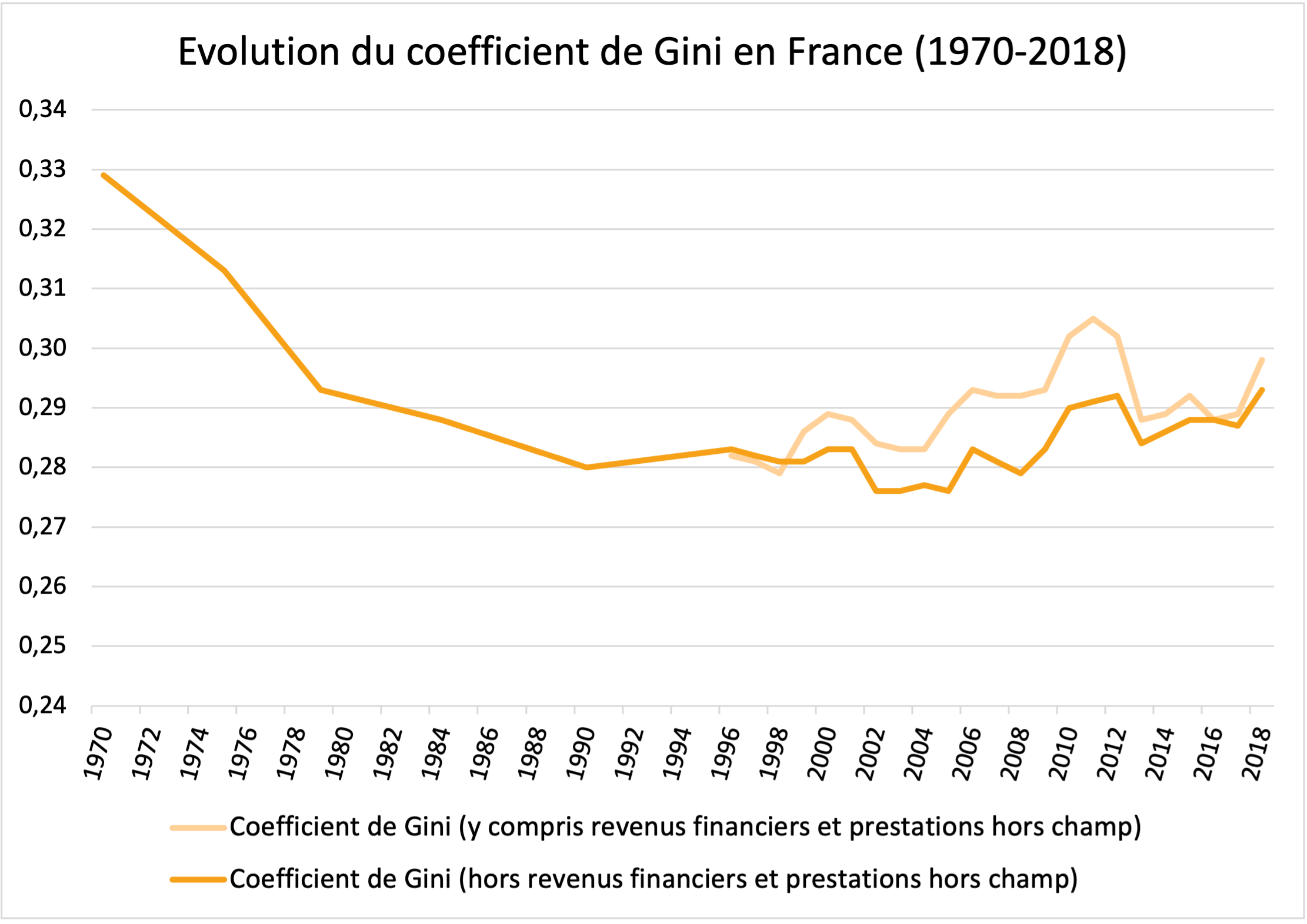
Source Insee, Revenus et patrimoine des ménages, 2021 edition. Note: standard of living corresponds to household disposable income divided by the number of consumption units (calculated using the modified OECD scale method). Out-of-scope benefits include benefits for disabled adults.
Reading: in 1970, the Gini coefficient in France was 0.329.
The limits of the Gini coefficient
The relevance of the Gini coefficient, which is based on the fact that it considers the entire income distribution, is also open to criticism. Indeed, it does not allow us to specify where inequalities come from. This indicator can give the illusion of summarizing all inequalities in a single figure, whereas, on the contrary, it provides a ” sanitized” vision of inequalities that is difficult to decipher, as it does not allow us to determine their characteristics. 11
Studies 12 have shown that the Gini coefficient is particularly sensitive to changes in income in the middle of the distribution (i.e., the indicator is sensitive to changes affecting households with incomes close to the average income in France). It can be argued that this is not necessarily what we are trying to highlight when we measure inequality – we are more interested in studying the distribution of income in the richest and poorest brackets.
Other synthetic indicators: the Theil indicator and the Atkinson index
Like the Gini coefficient, other synthetic indicators can be used to assess income inequality. These include the Theil indicator and the Atkinson index.
Like the Gini coefficient, the Theil indicator is higher the further you are from perfect equality. What’s more, the more dispersed incomes are in the distribution, the higher it is. Its main advantage is that it can be broken down into different sub-groups within the population and then added up for these different sub-groups. 13 For example, let’s consider partitioning the population into 3 groups or classes (an affluent class, a middle class and a working class). The Theil index can be written as the sum of two terms:
- a term that measures inequalities within each class (intra-class inequality): this means, for example, that among the “rich” there are “very rich” and “slightly less rich”;
- a term that evaluates inequalities between the 3 classes (inter-class inequality).
The Atkinson index reflects a population’s aversion to inequality, and is expressed as a percentage (%): for example, an Atkinson index of 10% means that the population is prepared to lose 10% of its total income for a more egalitarian distribution of income. Its measurement depends on the population’s degree of aversion to inequality: the more averse a population is to inequality, the more it is willing to give of its income for a more egalitarian distribution. 14
Using inter-deciles ratios to measure inequality
Other indicators, based on ratios at the level of the income distribution, measure income inequality by focusing on the incomes of the richest and poorest brackets: these are known as inter-decile ratios.
Presentation of D9/D1, D5/D1 and D9/D5 inter-decile ratios
Three main inter-decile ratios are used to measure income inequality within a country.
The D9/D1 ratio corresponds to the ratio between the minimum income level of the richest 10% and the maximum income level of the poorest 10%. It is therefore the ratio between the 9th decile and the 1st decile of the income distribution. 15 (see box on the decile concept).
The D9/D5 ratio corresponds to the ratio between the minimum income level of the richest 10% and the median income level. 16 Put another way, it is obtained by dividing the 9th decile by the 5th decile of the income distribution.
The D5/D1 ratio corresponds to the ratio between the median standard of living and the maximum standard of living for the poorest 10%. It is obtained by dividing the 5th decile by the 1st decile of the income distribution.
Below, we show the evolution of the D9/D1 ratio for standard of living in France. Comparison with the evolution of the Gini coefficient shows that the two indicators tell the same “story” of income inequality in France.
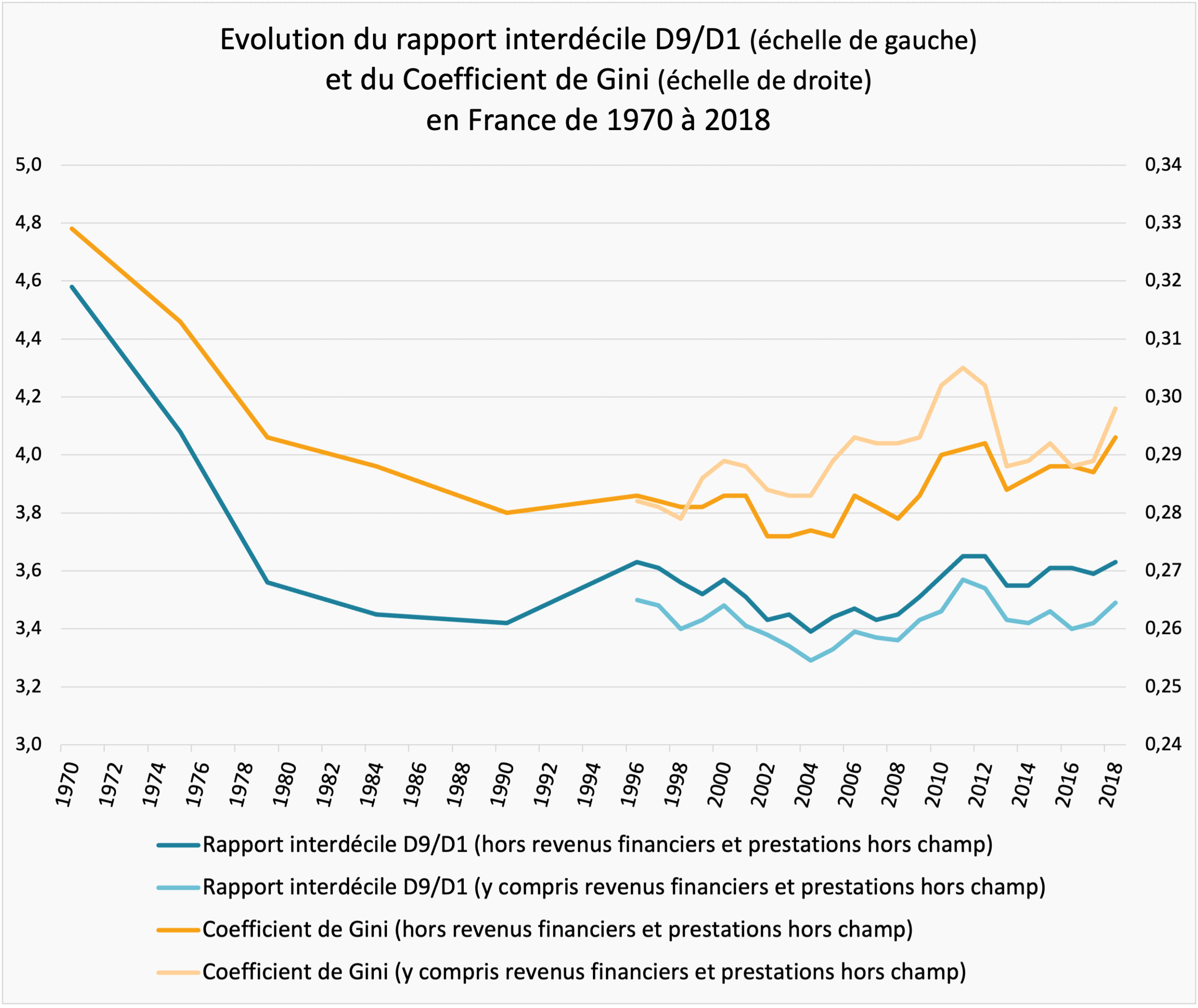
Source Insee, Revenus et patrimoine des ménages, 2021 edition. Note: the ordinate axis (vertical scale) on the left applies to the D9/D1 interdecile ratio, and the ordinate axis on the right applies to the Gini coefficient. Standard of living corresponds to household disposable income divided by the number of consumption units (calculated using the modified OECD scale method).
Reading: in 1970, the D9/D1 interdecile ratio in France was 4.58 (i.e., the income threshold above which the wealthiest 10% of households are located is 4.58 times greater than the income threshold below which the poorest 10% of households are located). In 1970, the Gini coefficient in France was 0.329.
Nevertheless, changing indicators can sometimes lead to different conclusions. The graph below shows the interdecile ratio for European Union countries in 2019.
D9/D1 interdecile ratio for European Union countries in 2019
Reading: in 2019, in Slovakia, the D9/D1 interdecile ratio is 2.7 (i.e., the income threshold above which the wealthiest 10% of households are located is 2.7 times greater than the income threshold below which the lowest 10% of households are located).
MISSING DATAVIZ: rapport-interdecile-d9-d1-pour-les-pays-de-lunion-europeenne-en-2019Source Insee, Standard of living and inequality indicators in the European Union (annual data 2019), December 17, 2021. Note: standard of living corresponds to household disposable income divided by the number of consumption units (calculated using the modified OECD scale method).
As we saw with the Gini coefficient, Slovakia is the most egalitarian country and Bulgaria the most unequal. However, we also note that in 2019, France has a higher Gini coefficient than Croatia, while its D9/D1 interdecile ratio is lower. In other words, France is less egalitarian than Croatia in terms of the Gini coefficient, but more egalitarian than Croatia in terms of the D9/D1 interdecile ratio.
This example highlights the fact that there is no single way of measuring inequality.
Criticism of inter-decile ratios
Although not synthetic indicators, inter-deciles ratios, and in particular the D9/D1 ratio, are criticized for being “blind” to what is happening within the richest and poorest brackets.
To understand this, let’s go back to what the D9/D1 ratio measures. It’s the ratio between the minimum income level of the richest 10% and the maximum income level of the poorest 10%. Consequently, as long as these two thresholds remain unchanged, the D9/D1 ratio remains unchanged. However, this gives no information on what is happening within the richest 10%: typically, if the income level of the richest 5% doubles while the income level of the rest of households stagnates, this does not change the D9/D1 ratio. However, it would be reasonable to describe this as an increase in inequality. 17
Mass ratios, Palma ratios and distribution tables
To respond to the criticism levelled at inter-decile ratios, we can consider indicators that take into account income masses rather than income thresholds.
The interquintile mass ratio
Noted (100-S80)/S20 or S80/S20, the interquintile mass ratio corresponds to the ratio between the total income received by the richest 20% and the total income received by the poorest 20%. Unlike the D9/D1 interdecile ratio, this indicator is sensitive to what happens within the poorest and richest brackets. If we take the example from the previous paragraph – i.e. a doubling of income for the richest 5% – we would see an increase in the interquintile ratio of the masses, synonymous with an increase in inequality.
In the specific case of France, we can see below that the three indicators – Gini coefficient, D9/D1 interdecile ratio and interquintile mass ratio – show similar trends over time: income inequality has been rising overall since the 1980s, despite a slight decrease since 2011.
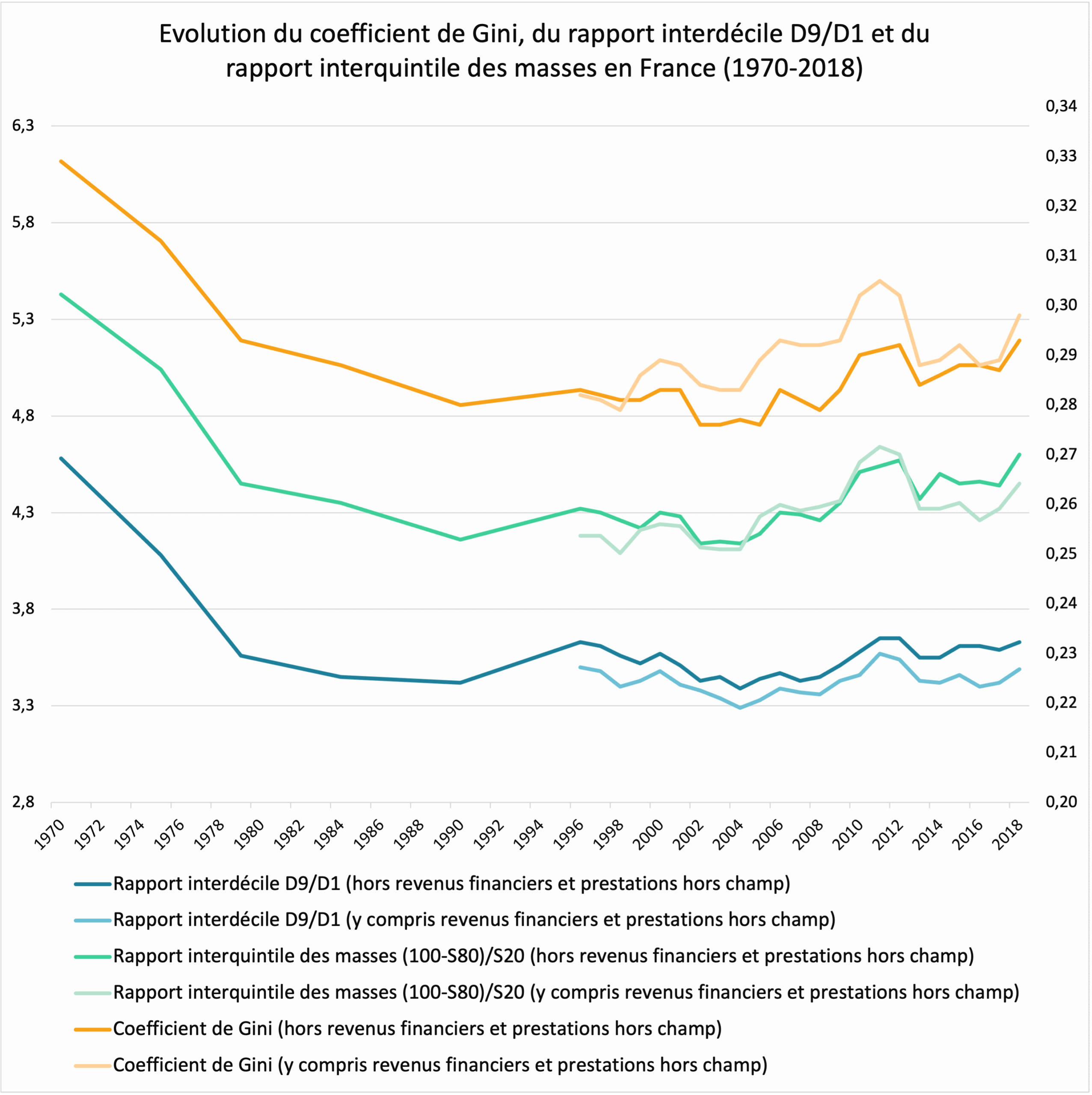
Source Insee, Revenus et patrimoine des ménages, 2021 edition. Note: the y-axis on the left applies to the interquintile mass ratio and the D9/D1 interdecile ratio, while the y-axis on the right applies to the Gini coefficient. Standard of living corresponds to household disposable income divided by the number of consumption units (calculated using the modified OECD scale).
Reading: in 1970, in France, the interquintile mass ratio was 5.43 (i.e., the wealthiest 20% of households received 5.43 times more income than the lowest 20%, even though the latter were four times more numerous).In 1970, in France, the D9/D1 interdecile ratio was 4.58 (i.e., the income threshold above which the wealthiest 10% of households are situated is 4.58 times greater than the income threshold below which the lowest 10% of households are situated). In 1970, in France, the Gini coefficient was 0.329.
Palma’s ratio
Variants of the interquintile mass ratio are possible, one of which is particularly fashionable: the Palma ratio. It is defined as the ratio between the total income received by the richest 10% and that received by the poorest 40%.
Unlike the interquintile mass ratio, the Palma ratio is not symmetrical: it considers only the richest 10% versus the poorest 40%. To justify this, economist J.G. Palma introduced the idea of homogeneous middles versus heterogeneous tails. Comparing different countries, he noted significant heterogeneity in the share of income received by the poorest 40% and the richest 10%, while the others – those in the “middle of the distribution”, i.e. the homogeneous middles comprising 50% of households – almost invariably account for 50% of national income. 18
The chart below illustrates the evolution of the de Palma ratio in France: in the mid-1990s, the richest 10% earned as much as the poorest 40%, whereas they were four times less… So, despite fluctuations – and a peak in 2011, as with the Gini coefficient, for example – the de Palma ratio has tended to increase since 1996, testifying to a rise in inequality in France.
Trends in the Palma ratio in France (1996-2019)
Reading: in 1996, the de Palma ratio in France was 1.01 (i.e., the wealthiest 10% of households received 1.01 times more income than the bottom 40%, even though the latter were four times more numerous).
MISSING DATAVIZ: evolution-du-ratio-de-palma-en-france-1996-2019Source Insee (taken over byObservatoire des Inégalités). Note: standard of living corresponds to household disposable income divided by the number of consumption units (calculated using the modified OECD scale).
Allocation tables and the case of very high incomes
Finally, another possible approach is to look at changes in the share of high incomes in national income. This approach, particularly favored by Thomas Piketty, lends itself particularly well to the case of the “ultra-rich”. In concrete terms, we show below the share of national income received by the 1% of households with the highest incomes in France.
The methodology used here makes it possible to study the evolution of this indicator since the early 1920s, and offers an interesting perspective. If we compare the 1920s with the 2010s, the share of national income received by the top 1% in France has been halved, from 20% to 10%. However, this reduction in inequality over almost a century needs to be qualified: in fact, this inequality indicator was at its lowest in the 1980s. Between 1980 and 2019, the top 1% of income earners in France saw their share of national income rise slightly, from 8.6% to 10.0% of national income in 2019, indicating a rebound in income inequality in France.
Once again, this example illustrates the importance of the study time window when talking about inequalities. With this indicator, the conclusion is not the same if we compare inequalities between 1920 and 2010 or between 1980 and 2019…
Share of national income earned by the top 1% in France (in %)
Reading: in 2017, in France, the richest 1% received 9.8% of all pre-tax income.
MISSING DATAVIZ: part-du-revenu-national-percue-par-les-1-plus-hauts-revenus-dans-le-revenu-national-en-france-enSource World Inequality Database. Note: income before taxes and social benefits. Couples’ income is divided by two, regardless of the number of children.
Some concluding remarks
This fact sheet illustrates the multitude of possible approaches and methods for measuring monetary inequalities. The first distinction to be made is between wealth inequality and income inequality.
The study of wealth inequalities highlights the relative enrichment of the world’s very wealthy since the 1980s.
Income inequalities are generally measured using disposable income or household standard of living. Particular attention must be paid to the time window in which inequalities are studied. In France, for example, inequality is expected to fall between 2011 and 2019. Nevertheless, this conceals a more global trend, namely that inequalities today are slightly more marked than they were in the 1980s.
There are many indicators for measuring income inequality, including the Gini coefficient, the D9/D1 interdecile ratio and the Palma ratio. Depending on the indicator chosen, the conclusions are not the same. For example, if we refer to the Gini coefficient, France is more unequal than Croatia in 2019, whereas it appears more equal than Croatia if we use the D9/D1 interdecile ratio.
There is therefore no single way of measuring inequality, and if we wish to answer the question ” Has inequality increased or decreased in France? ” or “Is inequality higher in France than in Germany? “, we need to be aware that the answer to these questions may differ depending on the indicator chosen.
Find out more
- Inequalities Observatory
- Insee, Revenus et patrimoine des ménages, 2021 edition.
- Oxfam report on global inequality (2022)
- Guillaume Allègre, “Are relative inequality indicators biased?”, Variances, December 16, 2019.
- Observatoire des Territoires, Fiche sur les inégalités de revenus en France, 2017.
- OECD website on inequality and poverty
- World Inequality Lab, Global Inequality Report 2018
- World Inequality Database (database and articles)
- We could also look at inequalities in access to goods (education, healthcare, etc.), but these have an important dimension and deserve special attention, and will be dealt with separately. ↩︎
- All occupants of the same dwelling form a household. The occupants are not necessarily related (for example, a shared flat forms a household). ↩︎
- For more, see Thomas Piketty, Le capital au XXIe siècle, Seuil, 2013, p 43. ↩︎
- For more information, see Frank A. Cowell, Measuring Inequality , 2011, p 4. ↩︎
- In other words, all individuals with a net worth in excess of $1 billion over the year in question. ↩︎
- Thomas Piketty, Le capital au XXIe siècle, Seuil, 2013, p 690-694. ↩︎
- Private assets are assets held by an individual. ↩︎
- Thomas Piketty, Le capital au XXIe siècle, Seuil, 2013, p 690-694. ↩︎
- Example: 1 single person = 1 CU, a couple without children = 1.5 CU, a couple with a 10-year-old child = 1.8 CU… ↩︎
- Technically, the number of CU is equal to the square root of the number of individuals N living in the household. Example: 1 single person = 1 CU, a couple without children = 1.41 CU, a couple with a 10-year-old child = 1.73 CU… ↩︎
- Thomas Piketty, Le capital au XXIe siècle, Seuil, 2013, p 417-420. ↩︎
- For more, see Anthony B. Atkinson, “On the Measurement of Inequality“, Journal of Economic Theory, vol.2, 1970, p.255. ↩︎
- For more, see François Bourguignon, Christian Morrisson, ” Une analyse de décomposition de l’inégalité des revenus individuels en France “, Revue économique, vol.36, n°4, 1985, p.741-778; ” Évolution des inégalités de niveau de vie entre 1970 et 2013 ” in Les revenus et le patrimoine des ménages, Insee, 2016 edition. ↩︎
- For more, see Anthony B. Atkinson, “On the Measurement of Inequality“, Journal of Economic Theory, vol.2, 1970, p.255. ↩︎
- So it’s not the average income level of the richest 10% divided by the average income level of the poorest 10%. ↩︎
- The median income level is the income level that divides the population in two: 50% of households have a higher income level and 50% of households have a lower income level. ↩︎
- Thomas Piketty, Le capital au XXIe siècle, Seuil, 2013, p 420-421. ↩︎
- For the notion of homogeneous middles versus heterogeneous tails, see Jose Gabriel Palma, “Homogeneous Middles vs. Heterogeneous Tails, and the End of the ‘Inverted-U’: It’s All About the Share of the Rich“, Development and Change, vol. 42 n°1, 2011, p.87-153. For the democratization of the “Palma ratio” measure, see Alex Cobham, Andy Sumner, “Is inequality all about the tails? The Palma measure of income inequality“, Significance, Royal Statistical Society, vol.11 n°1, 2014, p.10-13. ↩︎